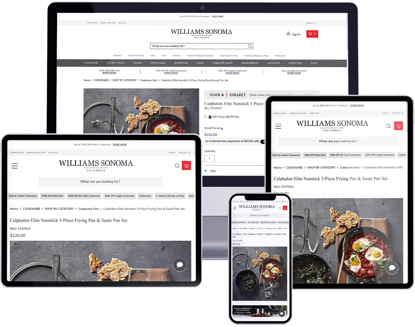
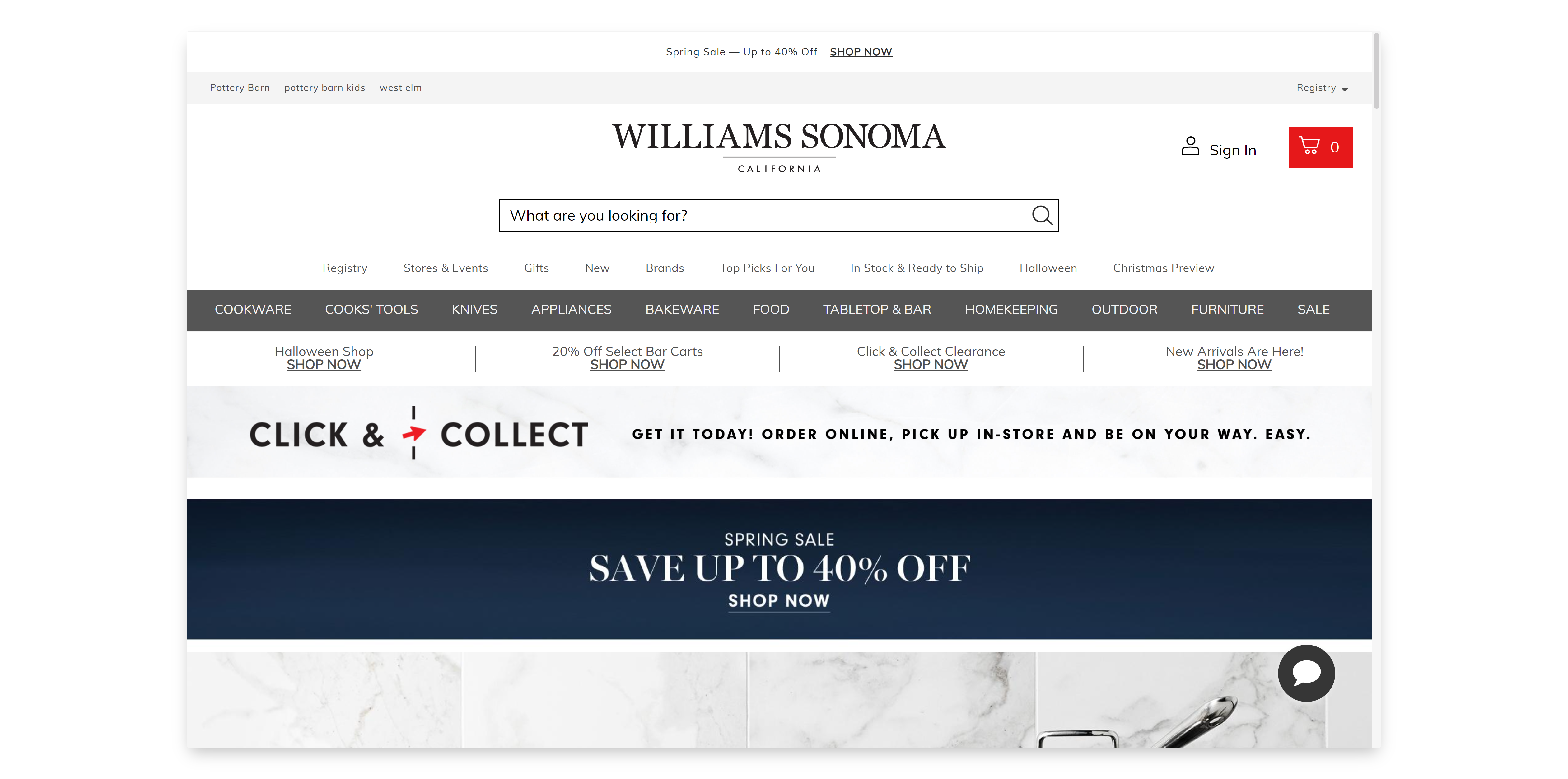
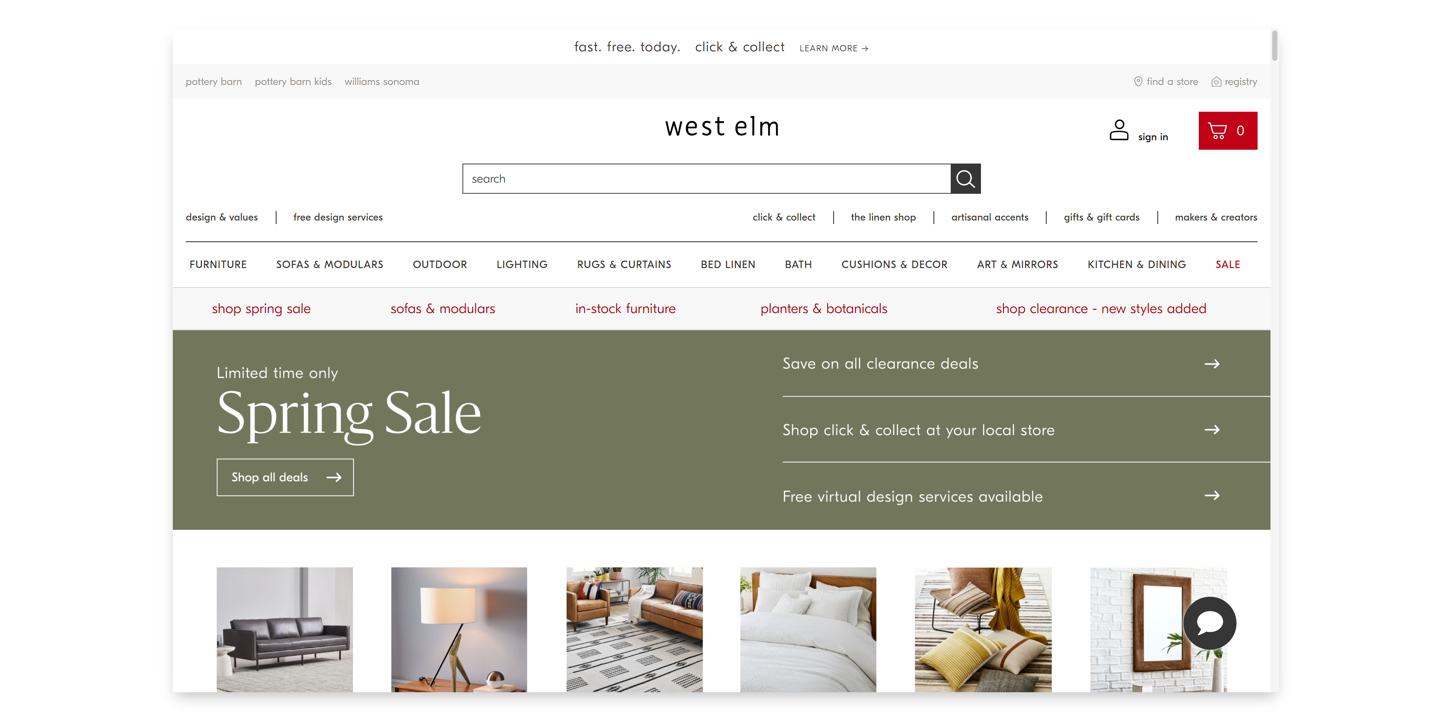
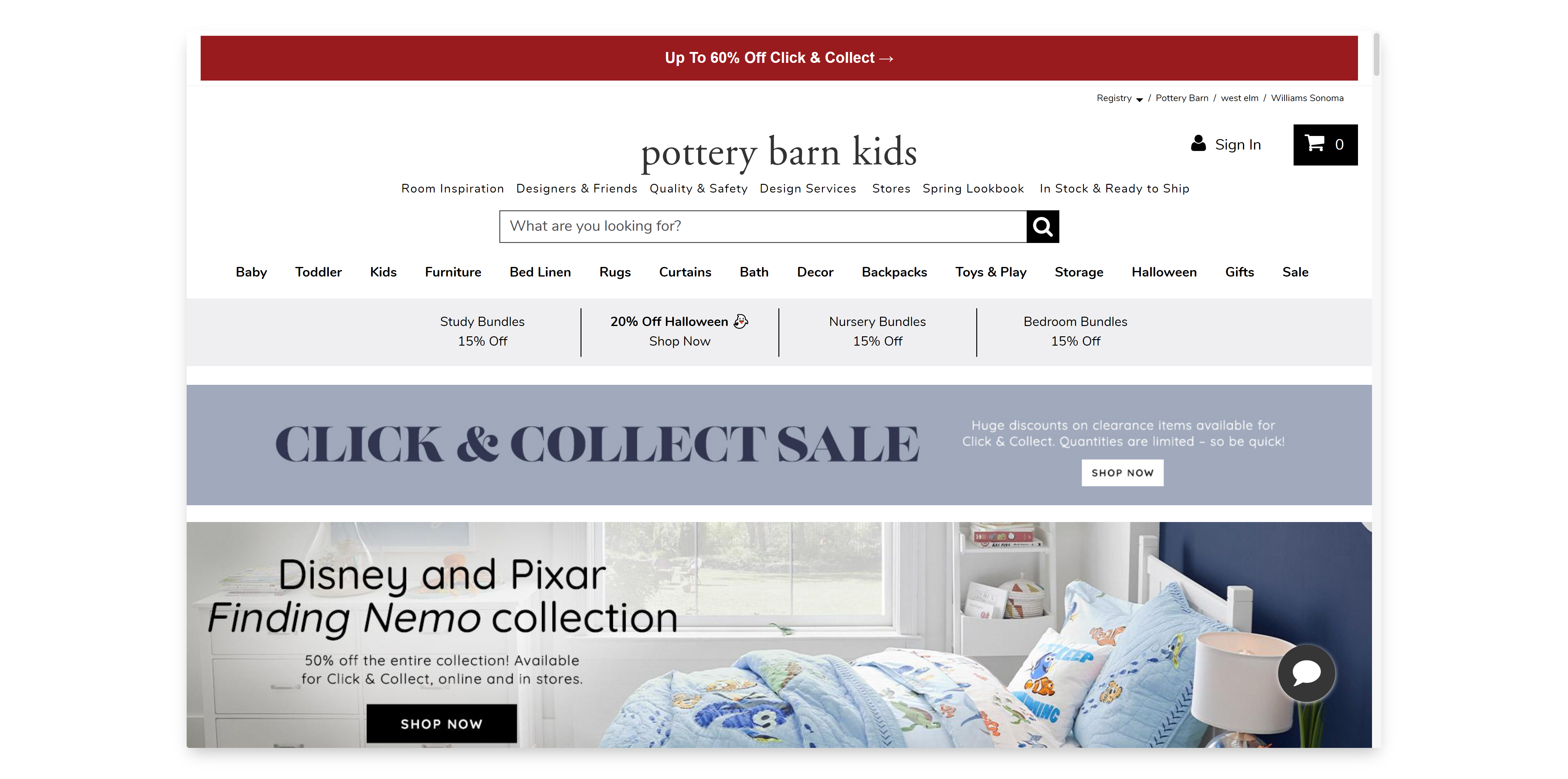
Kitchenware supplier Williams Sonoma, one of the US’ largest e-commerce retailers, was globally expanding into the Australian market with four branded websites and retail point-of-sale systems. The four stores in Australia were the first retail locations outside of North America to be owned and operated by Williams-Sonoma, as part of its overall global expansion strategy. The stores and websites for each of their four brands, Williams-Sonoma, Pottery Barn, Pottery Barn Kids, and West Elm, were to be launched simultaneously in an integrated multi-channel approach.
It was imperative to launch all four subsidiaries together, and on time. The design was to maintain a consistent interface across the different stores, whilst maintaining each’s unique branding and identity. It was also necessary to consolidate all four brands’ inventory structure and information architecture to provide a consistent, streamlined customer shopping experience.
The team met with the customer onsite for several days learning their business processes and requirements. The design process began with an in-depth analysis of their information architecture. To maintain a harmonious shopping experience across all four subsidiary stores, it was critical to establish a hierarchy of content that was as consistent as possible across all brands. I engaged a cross-functional team of representatives from Williams-Sonoma, leading card sorting sessions with them to organize the various types of products, regardless of brand. With literally hundreds of types of products, it was an arduous process that took several iterations, but we finally got to a result that revealed both the consistencies across the various brands, as well as the outliers. Information in hand, I designed an IA that organized and grouped products as consistently as possible across all 4 subsidiary stores, and designed a navigation that had a consistent experience, while accounting for each brand’s unique products, as well.
I also had to account for products various attributes and configurations. With each variation of an item provisioned as an individual product, search results on the frontend were too long and unmanageable, forcing the user to sort through numerous variations of the same items. After validating the solution with the customer’s back office and fulfillment teams, I designed a product detail page that enabled the user to view and select from all possible product attributes that the item was available in. Collaborating with the business analysts, the ERP backend was configured to support this approach so a pot’s various sizes, a rug’s dimensions, an oil bottle’s volume, etc., all appeared as one product on the frontend, with the user being able to select from an item’s various attributes on the product details page. The user also had the ability to filter search results based on the various attributes available.
Ater establishing how the subsidiaries’ content would be structured and organized in the front and backend, I collaborated with the Williams-Sonoma’s marketing team to understand each brand’s customers, visual style, brand voice, etc. Together, we created style guides for store’s brand, accounting for typography, buttons, color, imagery, tone, etc. and produced designed that were beautiful, engaging, and responsive.